Quick Tips On Styling w/ Automotive Prints
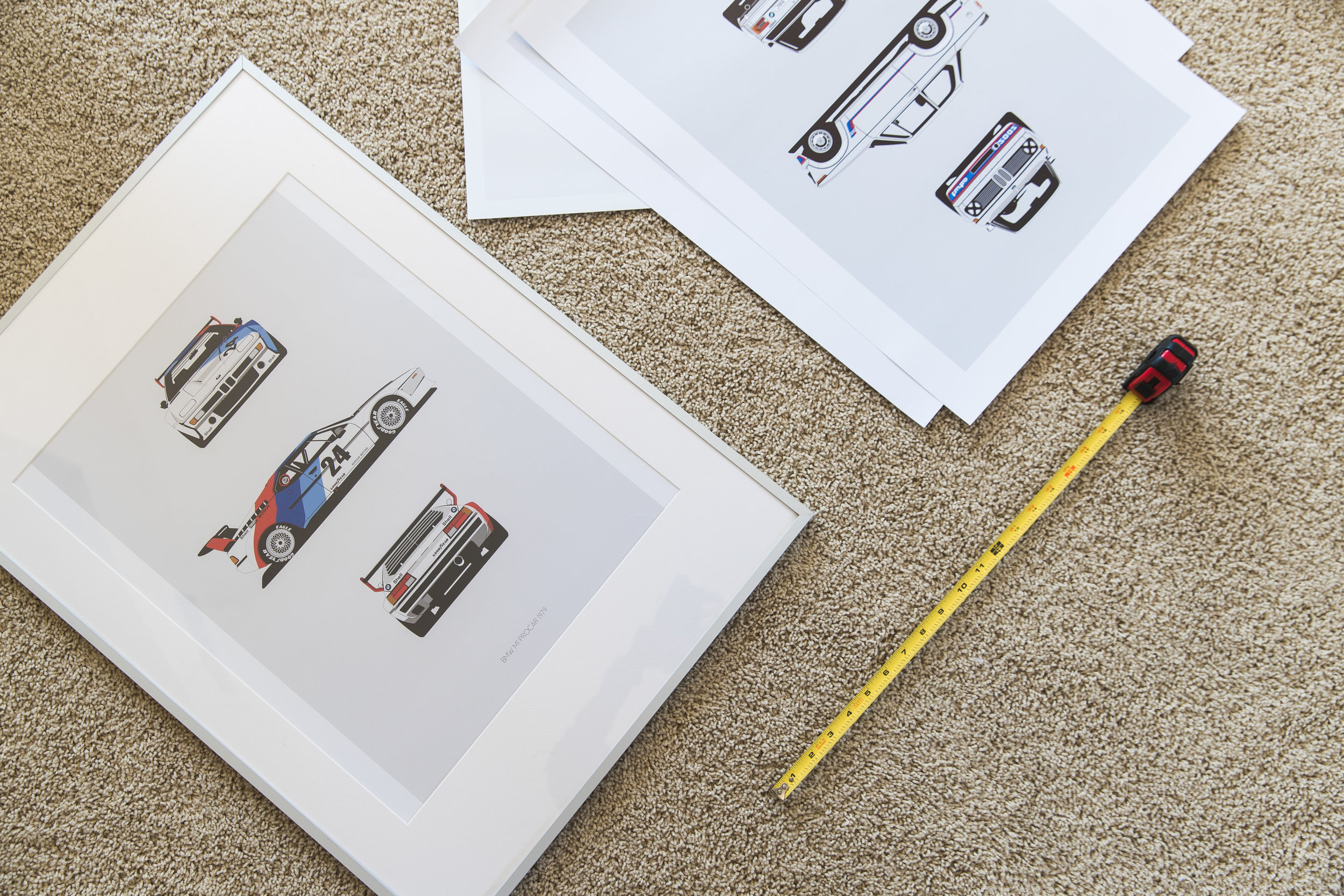
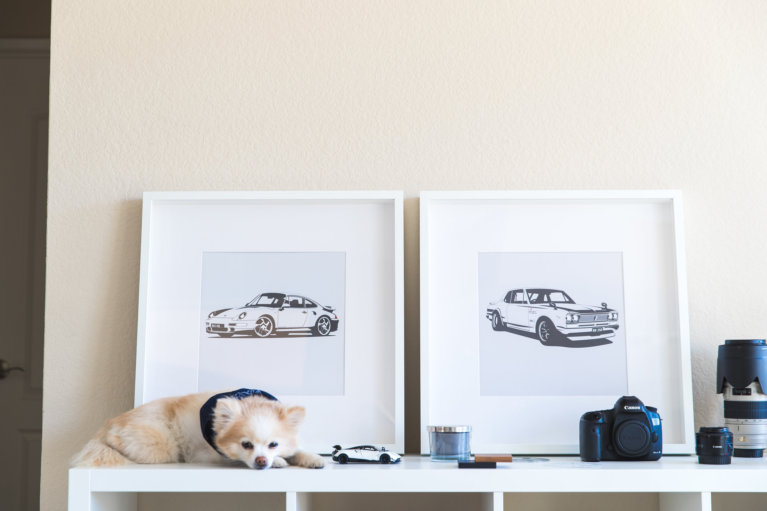
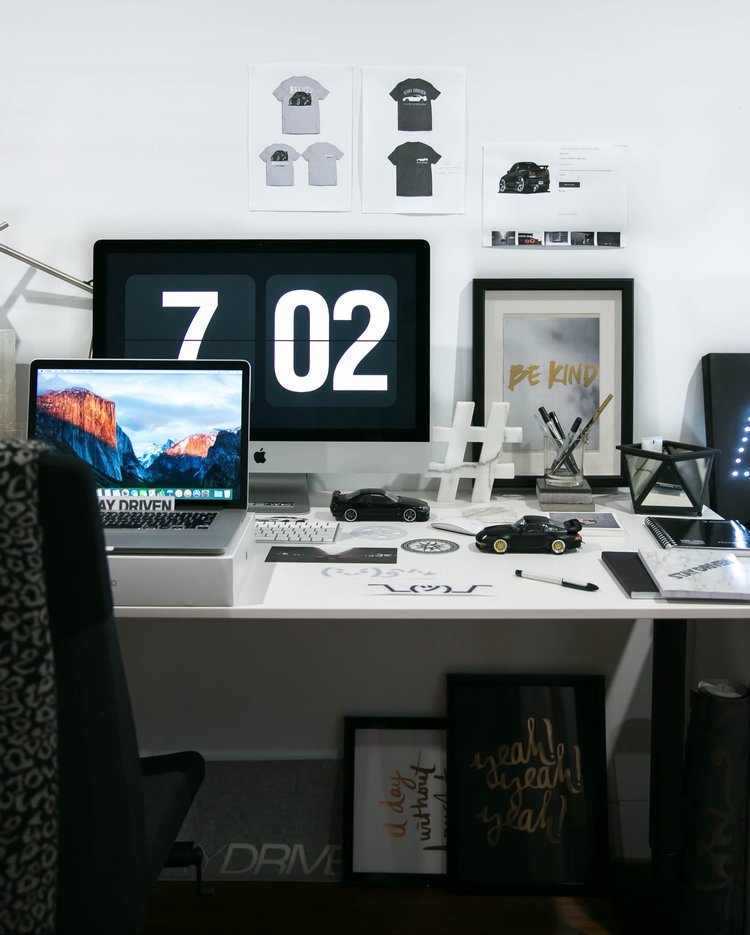
There’s nothing like automotive art prints to switch up your interior and breathe new life into a space. After feeling like my apartment walls were still a bit bare, I decided to get some new prints from Remove Before to freshen up our space. And since I couldn't decide which ones to get, I ended up buying multiple, making it easy to switch out whenever I pleased.
CHOOSE YOUR STYLE
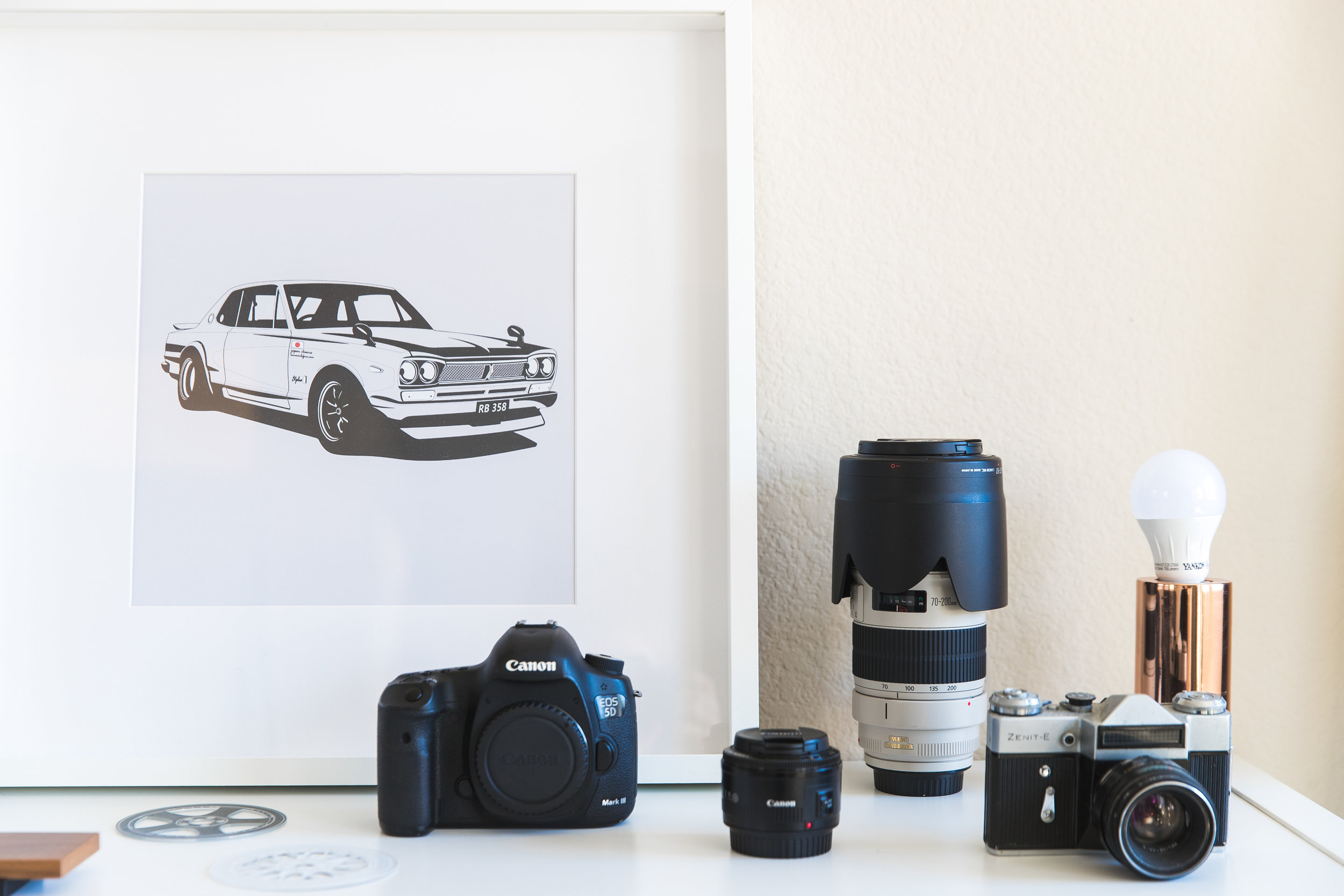
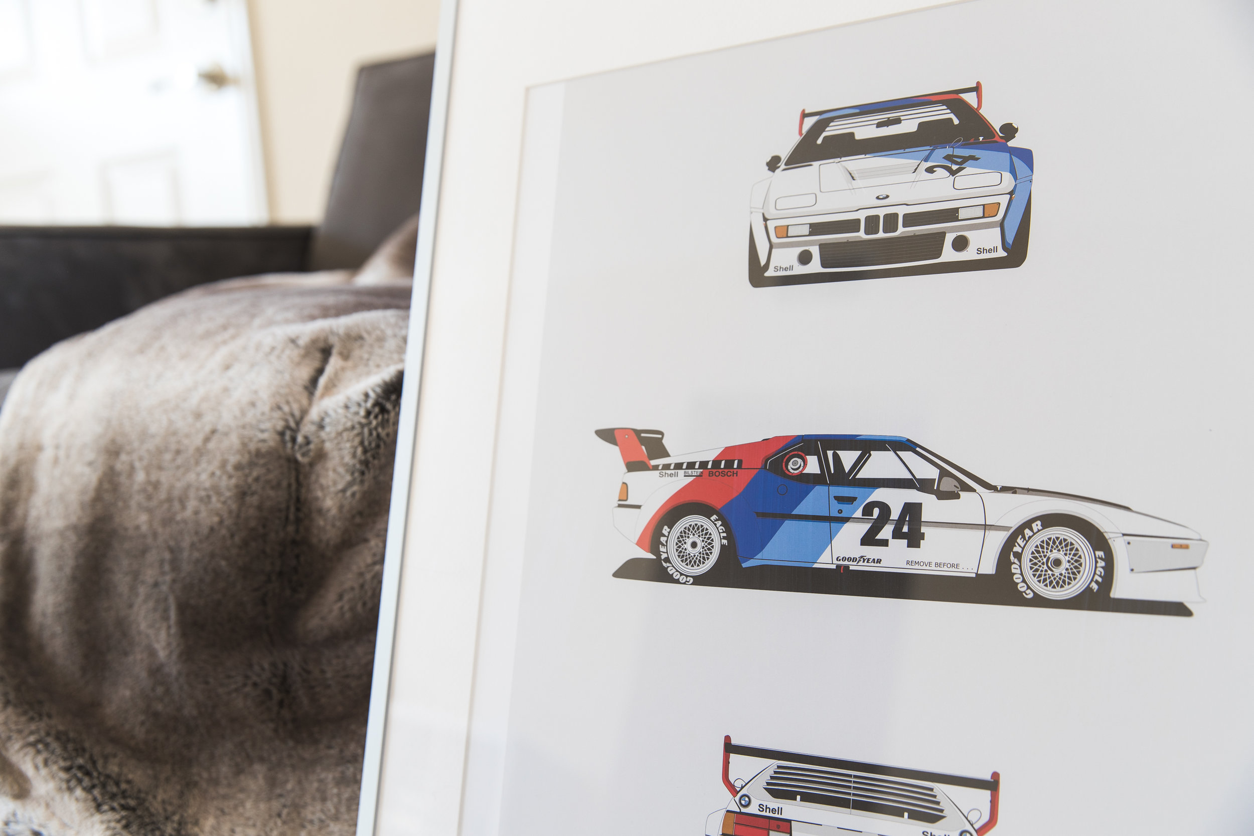
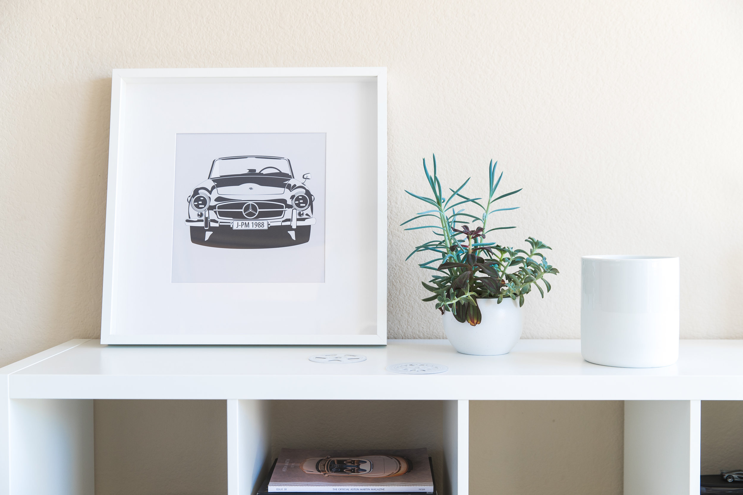
Adding prints gives you the option to go either vibrant or simple. If you are looking for a more minimalist style, go for a black and white print, like the above Mercedes SL190. If you're after a bit of color, go for something like this.
SIZE MATTERS
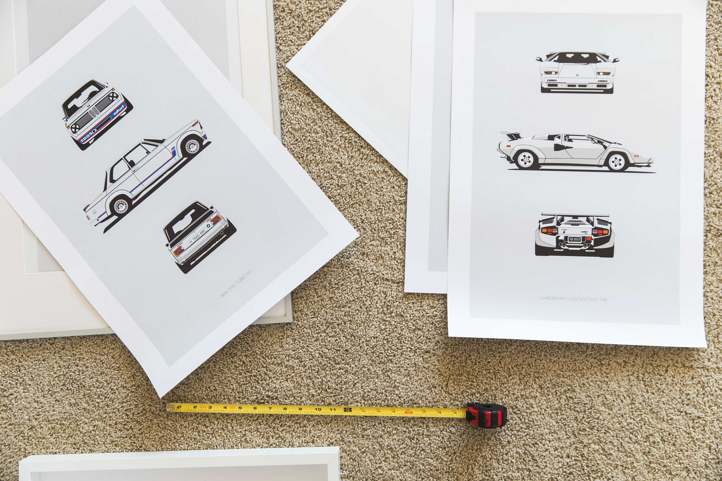
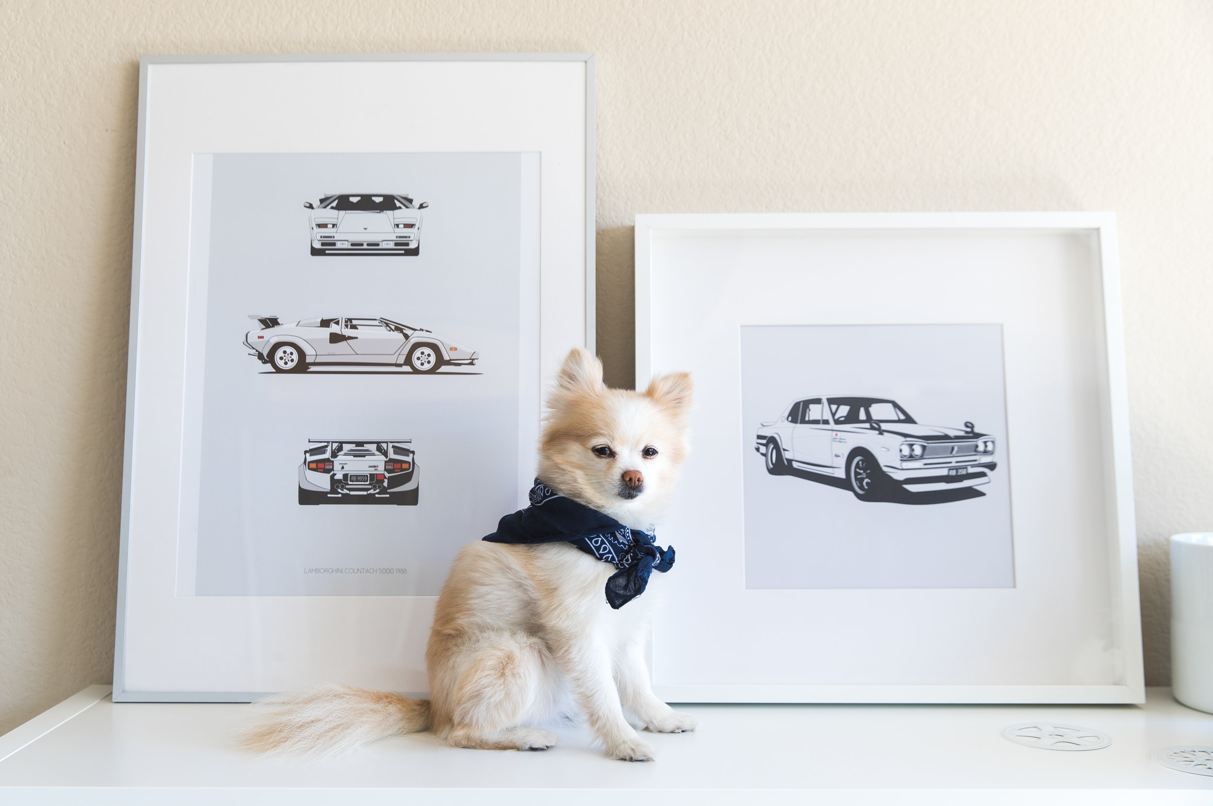
Get a mix of different sized prints to create interest within your home. I tend to like square and vertical prints, and using mat windows strategically is my ultimate framing trick. The mat window is the opening that is cut in a thick paper board, allowing the artwork to peek through.
FRAME IT
The style of your frame can make just as much of a statement as the artwork itself. It should enhance the piece of art by matching it in style or just being so simple that it goes away and disappears. If the print piece is visually light, go for a lighter frame. Frames in high-gloss or matte, light natural wood, or metal finishes are great for prints, and I always get mine from IKEA.
FIND YOUR BALANCE
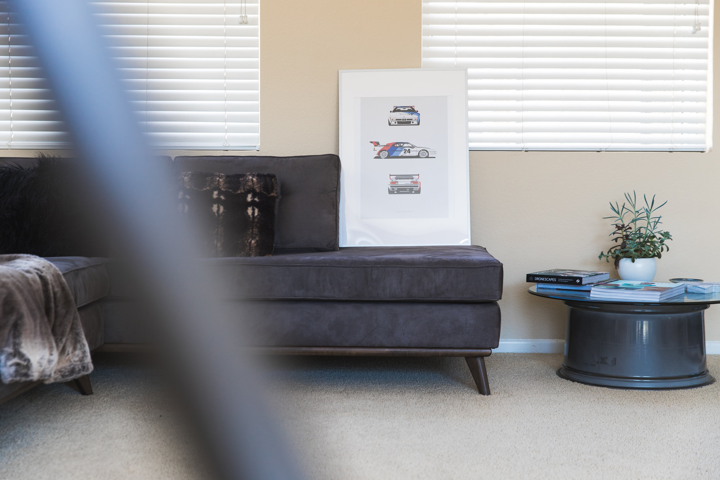
Good taste comes from having a knack at finding the perfect balance between too sterile and too cluttered. For me a good room has the right balance between being clean cut and streamlined, and having the right amount of accessories so it doesn't look too busy. Take into account the amount of furniture that you have in a room, if it is sparse, then a large print will fill up the visual field as furniture might.
SWITCH IT UP
The great thing about having multiple prints, is that you can switch your space up easily. If you must put several pieces together, hang them or sit them close together so they give the feeling of one large piece instead of many small pieces. Don't clutter the space with too many pieces. Open space is just as, if not more, important as the pieces you put in the space!
And if you don't have space for prints, why not gift it to someone else? I think I want to get this one for my Dad next!
HEAD TO REMOVE-BEFORE.COM TO SEE MORE OF THEIR RANGE
FOR MORE INTERIOR TIPS BE SURE TO FOLLOW ME ON @THEINTERIORDESIGNINSTITUTE


